What Makes a Good Logo
Technical Considerations in Logo Design
By Nikos Kitsakis, October 2025
What never fails to amaze me is the amount of junk information you will find online. The kind of SEO-driven garbage that fills up all the corners of what should be our information space. Mindless nonsense, written by mindless marketing assistants and, now, mindless AI bots.
Try to find a website of recipes, for example, which isn’t some ad-infested hellscape that has every kind of garbage information in it except, of course, the one thing you were actually looking for. The same goes for almost anything else these days. Travel tips, product comparisons, software tutorials… you name it.
This situation – and the fact that a lot of clients have asked me over the years – is the reason I’m writing about the topic of logo design now. Here too, the internet is full of absolutely idiotic banalities and truisms (that oftentimes aren’t even true), packed into SEO-first pseudo-blogs. Take this paragraph from one of these terrible articles masquerading as design advice:
Logos that are well-balanced appear harmonious and polished. Nothing is shifted too much to one side of the design or the other. When your design is off-kilter, it can appear too chaotic and make it difficult for the viewer to absorb all the information at once.
Make no mistake, this sort of writing is absolutely meaningless drivel of the lowest order. Why? Well, apart from the fact that you cannot make generalised statements like that about style in logo design, you can disprove the statement yourself if you just think for one second about the Nike Swoosh. What is symmetrical about it? Nothing. And it also doesn’t suffer from the sort of information overload that would make it hard to “absorb all at once”.
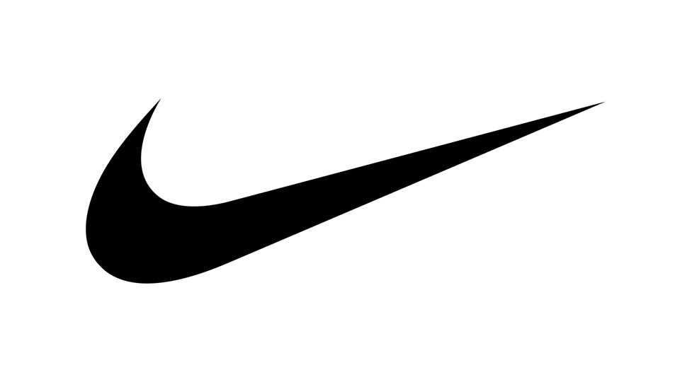
Don’t do it: According to some people, logos that are asymmetrical are badly designed. That is, of course, nonsense, as you can see in this example of the Nike Swoosh. Image: Wikimedia Commons.
Also, according to Interbrand, Nike’s brand value is estimated at about 45 billion dollars. A logo is not a brand, of course, but when I mention the name “Nike”, the image of the Swoosh will likely be one of the first things that comes to your mind. For our purposes, that’s good enough. So, in contrast to what was said above, there must be something correct about the logo despite it being “off-kilter”…
Let’s look at another piece of eternal wisdom from the same article:
Color isn’t the only way you can create contrast in your logo design. You can also layer shapes and lines to create vectors and patterns or make a 3D logo. Not only can these give your logo extra visual interest, but they can also be used to direct the viewer’s gaze to certain elements in your logo.
My translation of this meaningless babble into English:
You can do all sorts of stuff with lines and colours. Since we have no idea what we are actually talking about, we are just going to list all sorts of things that popped up when we entered “what is graphic design?” into Google: Stuff like layers, shapes, vectors, patterns, and 3D. It sounds good and helps with the SEO.
Seriously though, writing that colour “isn’t the only way you can create contrast in your logo design” is downright criminal, because it’s actually an extremely bad idea to rely on colour to achieve any kind of structural effect in a logo¹. And don’t get me started on the statement that lines and “vectors and patterns” can “direct the viewer’s gaze to certain elements in your logo”. First of all, “vectors and patterns” has literally no meaning in that sentence. It’s just word salad used as a filler. And secondly, that a visual element can “direct the viewer’s gaze” is a statement about as profound as saying that a roof will keep the rain from falling on your head.
And then there’s this gem, coming from a different source, a company that tries to sell an online tool with which, they claim, everyone can make a logo:
You don’t need to have a background in graphic design or even be artistically inclined to make a beautiful logo that will boost your business.
This and the other things we’ve seen remind me of a Monty Python sketch called How To Do It – a fake TV show in which the hosts explain, amongst other things, how to rid the world of all known diseases:
Well, first of all, become a doctor and discover a marvellous cure for something. And then when the medical profession really starts to take notice of you, you can jolly well tell them what to do and make sure they get everything right so there’ll never be any diseases ever again.
I concur with the co-host of that sketch who, having listened to that explanation, just says “great idea”.
Craftsmanship Versus Style
I will not discuss the creative side of logo design in this essay, and the reason for that is simple: A logo is a visual element that has to work both on a creative (artistic/psychological) level and a technical one. I am of the opinion that once you learn about the technical part, the creative should be much easier to do. It is also more important to realise that there is a distinction to be made between creative and technical considerations in the first place. The technical considerations you could also call technical constraints.
Charles Eames was once asked if he had ever been forced to accept compromises. He answered, “I don’t remember ever being forced to accept compromises, but I have willingly accepted constraints”. This is an important concept to learn: In any design work, there will always be constraints. The most obvious ones are time and money, the universal constraints.
But consider designing a wayfinding system for a hospital. In a case like that, the people you’re designing for will define many of the constraints for you. You will need to choose a highly legible typeface, a colour palette that helps to guide people rather than simply looking attractive, and you will have to take into account that many patients may have cognitive or visual impairments. And these are just the patients. There will be other stakeholders, architectural limitations, industry standards, etc.
You cannot do design work without constraints. Accordingly, the most horrible design brief you could get is “you can do whatever you like”. This doesn’t work by definition. Design work is problem solving, and therefore the first step is to define and understand the problem.
With logos, the technical constraints are universal and come from the fact that a logo has to work in a lot of different environments. Working on the assumption that you are not deliberately breaking the rules (more on that later), the constraints are: Scalability, aspect ratio, colour, and, by extension, simplicity.
Scalability
A good logo should be scalable. That simply means it should appear the same when viewed at a small size as when viewed large. A small size could mean an avatar on a social media channel such as instagram, while a large version could be the logo on a building or behind a counter. If the same exact logo works well in these sizes (and those in between) that’s already a good sign. The preconditions for this are that there are no elements in the logo that are too delicate or ornate.
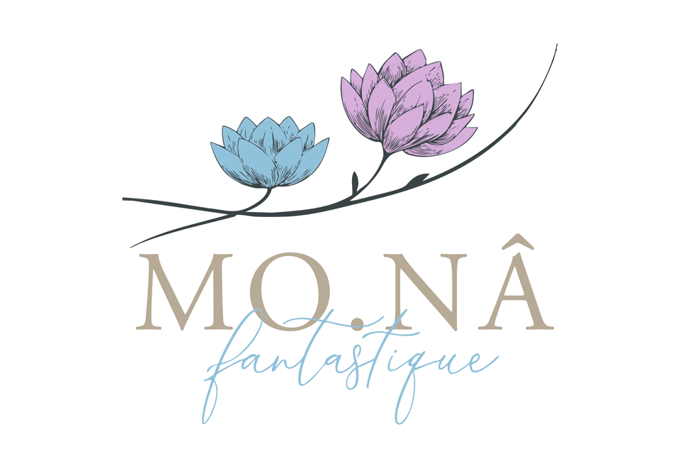
A poorly designed logo.
The logo above is a typical example of a job badly done. It was made by a self-proclaimed “logo designer” who very obviously had no training in graphic design at all². It’s a pretty amateurish job, which makes it useful for demonstrating my points about logo design.
While the whole composition might just be considered fit to be put on a postcard, it doesn’t meet any of the criteria required to pass as a logo. Take a look at the comparisons below. They show you how a professional logo can scale to different sizes while our amateurish one cannot:
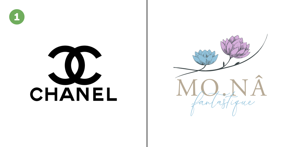
The Chanel logo compared to the “MONA” logo. They are somewhat comparable in that they both have a short line of text underneath a graphical symbol.
In the first comparison with the Chanel logo, you can see that our MONA logo already lost some of the finer details in the flowers that it had in the picture further above. That’s not good, and it gets worse.
In the second image, both logos are scaled down to 25% of their original size. The Chanel logo retains not only its character but also remains recognisable and legible. The MONA logo, on the other hand, is breaking apart quickly. The handwritten second line becomes unreadable – actually almost invisible – and the two flowers are nearly impossible to identify as such unless you’ve already seen them at full size. The interlocking Cs of the Chanel logo don’t have that problem.
Finally, in the third picture, the logos are scaled down to a minuscule 10% of their original size. On a high-resolution display, you might just be able to read the letters MONA, but they are extremely thin. The rest of the logo looks like noise. The Chanel logo on the other hand holds up relatively well, even at this scale.
You can think of a couple of scenarios in which this becomes an important issue. Imagine, for example, that our two logos are on buildings on a shopping street but they are far away. Even if you know the MONA brand, your eyes might skip over the shop sign because the logo just won’t register. The same is far less likely to happen with the Chanel logo.
Logos that don’t scale well are also harder to print at small sizes and look worse in those cases too. Embossing them is more difficult, if not outright impossible, and so is having them embroidered. For these reasons, the degree to which a logo can be scaled is also sometimes called its robustness.
Aspect Ratio
The aspect ratio is another thing to consider when creating a logo. While not as important as scalability, it will determine how flexible the logo can be used in different environments. Anything from a square aspect ratio to a slightly horizontal one works best in most cases:
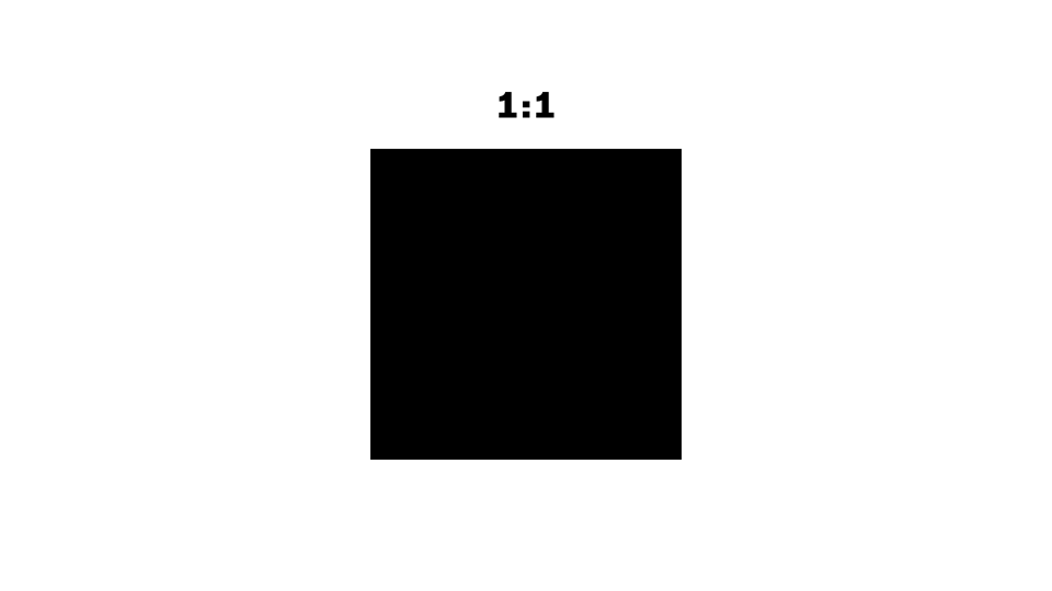
A square aspect ratio, or something very close to it, works well for logos in most situations. Anything wider than 2:1 can potentially cause problems.
While you could also make a logo that is taller than wide, this usually doesn’t work too well in reality. Still, which aspect ratio you choose will ultimately depend on where you will use the logo most often. With this being said, let’s look at why I am suggesting not going beyond a 2:1 ratio in the first place.
The three logos in the first image below will be familiar to you. I chose them because they conform to the aspect ratios that I find ideal. Also, they are a good mix in terms of what they represent graphically, with one being an icon, one a wordmark, and one a stylised letter.

The aspect ratio of a logo can influence its appearance depending on the context. All of the logos are from Wikimedia Commons.
Imagine that in the first image, someone had tried to arrange the three logos in such a way as to give them equal importance. Let’s say those three companies are all sponsors of a film festival. All of the logos are scaled so that they have the same height when measured. If you’ve read my essay about optical corrections in typography, you should know that measuring is never the way to go in visual design. And indeed, the Visa logo appears bigger than the other two, since its aspect ratio makes it wider than tall.
This effect is counteracted in the second image by scaling the logos in such a way that they visually appear to be the same size.
Things start to get interesting in the third picture. A new sponsor for the film festival has joined the others on the sponsor wall. Since the Samsung logo is a wordmark like Visa, we scale it to the same height, correct? As you can see, this doesn’t work, since now it seems visually larger than the other three – an unfair advantage since all sponsors support our film festival with the same amount of money.
The fourth picture shows an attempt to solve this problem. The Samsung logo is now scaled in such a way as to appear the same size as the others. Since that is almost impossible to do, however, it’s not a very satisfactory solution. The logo is pretty wide and therefore an awkward fit in this arrangement: It seems at the same time to be too small while it’s still the widest in the group. There is no really good solution to this problem.
While they are definitely not an everyday use case, logo arrangements like this appear more often than you might think. Our example of a sponsor wall is one thing, but you’ll find similar cases elsewhere: Product packaging with a row of multiple logos, an online store that lists all brands that it sells, and so on.
Consider also the case of social media avatars. This, in my view, is one of the strongest arguments for having a logo with a sensible aspect ratio. An interesting fact to think about in that regard is that most of today’s high-value brands had their logos before this use case existed, yet most work very well. An indication of the universality of good design:
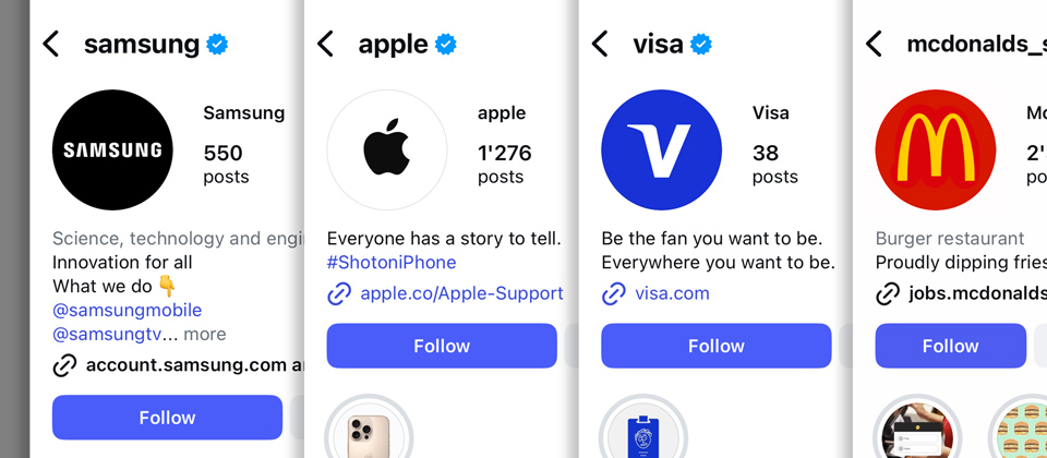
The Instagram pages of our four example brands. Click the arrows to see what the Visa logo would look like if the whole wordmark were used.
Here too, the Samsung logo doesn’t really work as well. While it’s not a showstopper, the aspect ratio of their logo is too wide for an avatar like this. It certainly lacks the punch of the others in this context, don’t you think?
Visa does something interesting: While, as you can see in the second picture, their whole wordmark would work well enough, they still decided to use just the first letter with the special “wing” serif. While that serif makes the letter V recognisable as the brand all by itself, I would have used the whole wordmark.
Take a look at the following example. After everything we have now seen regarding the aspect ratio of logos, it should be clear that this is far from ideal:
The Scott logo has an aspect ratio of nearly 5:1. If you remove the stylised S on the right, the remaining wordmark comes out at 9:1.
Context matters, however, and so what Scott did with their logo and its aspect ratio is not a mistake but actually a good example of how to break the rules when it makes sense. Scott is primarily known for their bicycles, and it is on the down tube of those bicycles that their logo can really shine. Not only that, but they’ve split the logo into the wordmark and the stylised S, the latter being used as an emblem on the front of the bicycles:
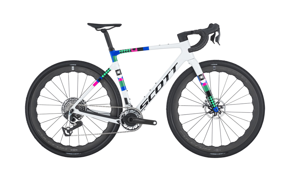
The Scott logo on the down tube and the front of one of their bicycles.
Scott, of course, neither invented the idea of the down-tube logo nor are they the only maker of bicycles to do this. But the example of the bicycle is useful in showing how breaking the rules deliberately can make a lot of sense.
Once you have understood why the ability to scale and the aspect ratio are important, you will already have acquired the two most essential pieces of technical knowledge you need to build a good logo. Let’s look at the last.
Colour
A good logo should not rely on the use of colours. Its outline should be enough to make you recognise it. If it works purely by virtue of its silhouette, it will also work in colour – but not the other way around. This is the single most important reason not to rely on colour when designing a logo. Additionally, a good logo should also be able to be embossed, and that use case presupposes a monochrome version.
There is also a historic reason for why it is considered good practice to design a logo with just one colour: Newspapers used to be monochrome and, naturally, so were the ads. When colour printing for ads was eventually offered, it was, of course, more expensive than printing just in black. The logo designers of those days took it for granted that their creations would be used mainly in one colour, and they designed them accordingly. Today, there are still situations where the logo has to work like that: It might be printed on receipts or etched in glass and metal, for example, and there are many other such cases. Take a look at the variations of the Apple logo as it was used in the 1980s and 90s below:
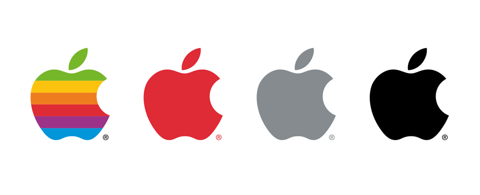
Some old versions of the Apple logo.
The Apple logo provides a good example of the widespread concern with the costs of printing as it existed a few decades ago³. After all, the rainbow-coloured Apple logo consisted of no fewer than seven spot colours⁴. The next cheaper option was to print it in the four process colours. If that was also not feasible, you had more options still. This is what Apple wrote in an old corporate design guide:
When you cannot justify the use of seven colours or the four-colour process then you can show the Apple logo as a monochrome silhouette; in black, Apple Grey or Apple Red.
While the cost of colour printing is usually not considered a serious obstacle anymore (some companies even have logos with colour gradients in them), I still think that relying on colour is bad practice for the reasons I mentioned above. The Apple logo is a good demonstration of this: While the rainbow colours were indeed a powerful tool for brand recognition, the logo never relied on them and was (is) just as recognisable without.
If you’re still not convinced that a logo should work without colours, consider that in the Unicode Standard – which governs all of our writing systems – some 290,000 characters are encoded. And these characters share an important commonality with logos: Both are designed to be understood as single-colour shapes, recognisable by their geometry rather than by colour.
Simplicity
If you add all the constraints that we looked at together – scalability, aspect ratio, and colour – you will inevitably come to the realisation that a logo that is simple in its structure is best. And indeed, this (somewhat) mirrors Antoine de Saint-Exupéry’s famous quote that “perfection is achieved, not when there is nothing more to add, but when there is nothing left to take away”.
That being said, the rules can and should be broken when it makes sense. We have seen that with the Scott logo already. When you think that the style or character of the brand you work for demands something peculiar, something which doesn’t adhere to all the rules we looked at, then go for it. But do it very deliberately. The Zara logo is a good example of this:
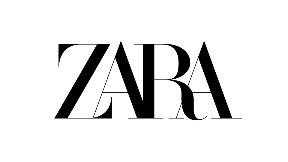
The Zara logo breaks the technical rules for logo design on purpose. Image: Wikimedia Commons.
Obviously the logo doesn’t scale too well, but the people at Zara know that. It is being used with this trade-off in mind. In their case, the style they were going for trumped versatility, and that’s perfectly fine. There are many other examples like this. The trick is knowing when you can get away with it.
From now on, whenever you see a new logo, ask yourself if it was designed with the constraints of scalability, aspect ratio, and colour in mind and, if not, whether that decision was likely deliberate or not. You will learn a lot about logo design with just those simple observations! Please also contact me and send me your favourite examples of good or bad logo design.
- Every brand needs a colour, but that is not the same as relying on colour to be a structural part of a logo. ↑
- I actually recreated this logo in the style of the original, since I don’t want to name the person who made it or make it findable via reverse image search. ↑
- Of course, it’s still cheaper to print just one colour than four or seven, but you don’t hear about it as much anymore. ↑
- Six colours in the apple itself and black for the registered trademark symbol. ↑
While writing this essay, it has been suggested to me that I should have featured logo systems more prominently – what Scott and Visa did with their logos, for example, where you can have different variations or parts of logos to use here and there. The reason why I didn’t go into this is that I wanted to keep the essay simple and concentrate on the case of creating one good logo. Also, I myself am not such a big fan of logo systems, because I think they often devolve into a battlefield of logo variants that have to be used in a context-dependent manner. Logo systems, or rather brands with logo systems, can often seem rather confused.
All logos shown are registered trademarks of their respective owners. Their use in this article is for illustrative purposes only, in the context of discussing logo design. Thanks to Scott for letting me use their product images.