The Basics of Legibility
A Short Guide for Non-Typographers
By Nikos Kitsakis, April 2024
I got an interesting piece of feedback regarding part one of my article about buttons in user interfaces. A reader pointed out that while I mentioned that Apple uses a rather unsuitable typeface in their operating systems, I hadn’t elaborated on why I believed it to be so. Moreover, the reader wasn’t persuaded by the alternative I proposed, feeling it was neither better nor worse.
It’s true: I didn’t explain why Apple’s “San Francisco” typeface is not the ideal candidate for a user interface or why “FF Unit”, which I suggested as a possible replacement, would have been the better choice. It would simply have been outside the scope of that piece to do so. That is why I’m now writing this: A short guide to legibility for non-typographers and UX designers.
The shapes of letters
Typography isn’t something that is particularly hard to learn but it takes the right sources to learn from, some talent and a lot of time. I myself finished a four-year typography school some 25 years ago and I’m still learning new things today. The scope of this piece, therefore, cannot be to teach you everything there is to know about typography. It cannot even be to teach you everything there is to know about legibility. For that reason, I will concentrate mainly on the shapes of letters and how their design can be conducive – or detrimental – to legibility.
Familiarity
Since we are mainly going to look at letter shapes let’s start with familiarity. You will read best what you are familiar with. The following picture illustrates that point:
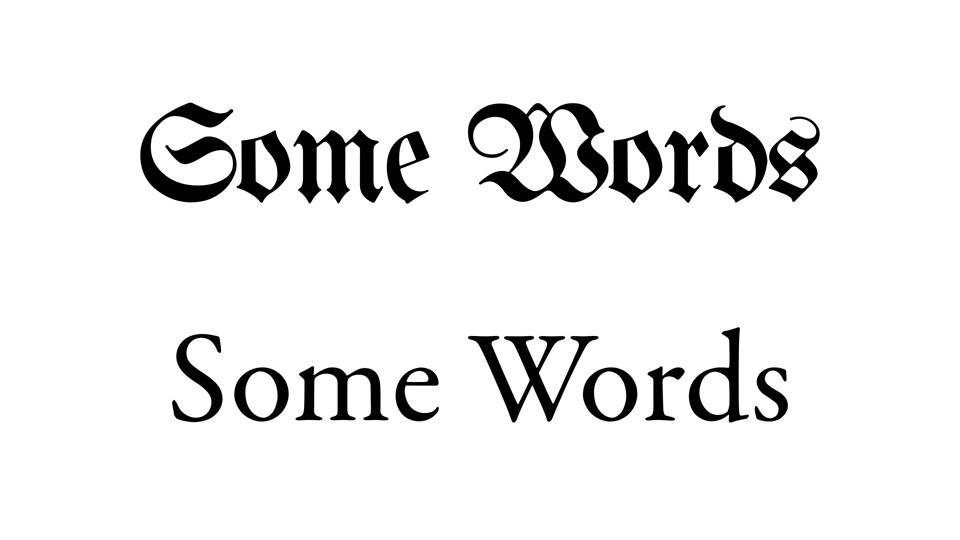
We can read best what we are used to.
The first line is set in what is called “Mainzer Fraktur,” and the second line is set in Garamond. I’m going to go out on a limb and assume that the vast majority of my readers had an easier time reading the second line of text over the first. That in itself, however, is not so interesting. What’s interesting is the realisation that, for German speakers 100 years ago, a typeface like the first one (called Blackletter or Fraktur) was a normal typeface which they saw whenever they opened a book. In fact, they could easily switch back and forth between a Fraktur, and a Garamond-like (or “Old-style” as it is called) typeface since those were also widely used.
Today that is not the case anymore. Fraktur typefaces were phased out (starting with an edict by the Nazis, of all things) and everyone now reads something that is or is similar to either Old-style or Grotesque (think Helvetica etc.) typefaces. The point is that we are now used to these typefaces and that, above all other considerations, has the biggest influence on legibility.
Why not San Francisco?
Let’s try and answer the comment of my reader above. Why is San Francisco not the best typeface for a user interface? After all, Apple has gone through quite some trouble designing it in-house. Do a search on the matter and you will find articles and videos for developers, where the people from Apple explain their thinking. They talk about optical sizes, different use-cases, space efficiency, expressiveness and so forth. It all sounds very professional.
And while – on a purely technical level – they certainly did a good job, I argue that they essentially did the wrong one. You see, there is a problem that I call the “Japanese Sword Fallacy”: The Japanese made the best swords in the world, far better ones than anyone else. They were lighter, yet sturdier than their western counterparts, sharp like a razor and so forth. The problem is, that even the worst 9mm Pistol is the much better weapon, for you can just shoot the sword-wielding Samurai from across the street.
Apple’s San Francisco falls into the same category as the Japanese sword: It might, from a technical standpoint, be a very well designed typeface, but it’s the wrong kind of typeface to begin with. Apple’s typeface lacks two things that any typeface (to a different extent) needs: Personality and purpose.
When I say that San Francisco doesn’t have much personality it’s because I perceive it as being extremely bland. And by that I don’t mean restrained or minimalistic, but bland. “Helvetica” is a minimalistic typeface. So are “Univers” and “Akzidenz Grotesk”. And while they would be equally unsuited as UI typefaces, they are not quite as bland. Bland, yes, but not to the extent that San Francisco is. They have their idiosyncrasies that give them a little bit of personality at least.
Much more important is, however, that San Francisco doesn’t have any purpose. By that I mean that it doesn’t do what it needs to do in the context of what it was made for. In its case, to be used in a user interface. Take a look and click the arrows:
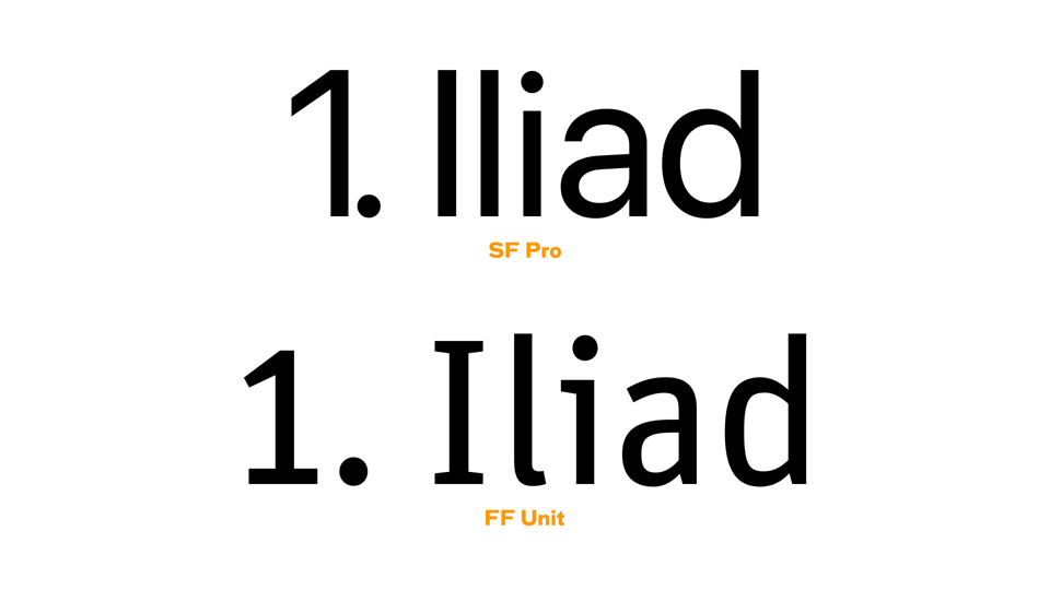
The individual characters of San Francisco lack the sort of uniqueness that would be conducive to legibility. Or do they?
If you compare San Francisco (or SF Pro as Apple also calls it) to FF Unit, you’ll see that the numeral “1” and the shapes of the first three letters of the word “Iliad” are much more distinct from one another in FF Unit than the same characters (or glyphs) are in in SF Pro¹. This was done on purpose, of course: Typefaces like FF Unit were designed with legibility in mind, and one of the things a type designer does in that case, is ensuring that visually similar letters have shapes that make them more distinct from one another.
The irony is though, that San Francisco actually has alternative glyphs with those legibility features built into it. They are just never turned on anywhere! And, to my eye, they are not as consistent in their design as the ones in FF Unit. So, while the more legible alternative characters in SF Pro certainly would help if they were ever turned on, they simply are not. Thus, they might as well not be there at all and serve no practical purpose in the real world².
Would I personally choose FF Unit over San Francisco for the user interface of all Apple operating systems, if those two were the only choices? Yes. Would its personality match what I would associate, in my mind, with the general design language of Apple? No. While SF Pro, on top of being harder to read than it has to be, is too bland and lacks personality, its definitely closer in style to what I imagine an Apple system typeface should be. But that’s also part of the problem: Style over substance. I think it should be possible for a corporation that spends more than 20 billion US dollars per year on R&D (what the hell on?) to make a typeface that is both minimalistic yet with personality, and legible in the context of user interfaces.
Text vs words
Why does any of that matter? After all, we can all read texts written in typefaces like SF Pro perfectly fine. Yes, indeed, we can read texts. The word text implies, though, that there’s multiple words written one after another: A text gives you the context to understand the individual words. In user interfaces, however, you will come across many instances of there being just one word and not a whole text. Think of buttons and menu items for example. It is in those cases that the distinctiveness of the individual letters in a typeface really matters.
This problem is actually a well-known one in the world of wayfinding and signage and the designers there have solved it a long time ago.
Imagine yourself looking at a sign of a place name of which you never heard before. You will be confronted with just one word and it might seem weird to you. This happened to me when I came across this sign on a highway in Germany:
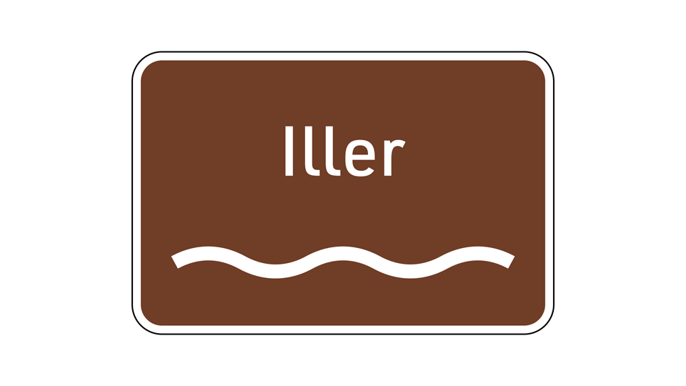
A street sign that indicates a river in southern Germany. The typeface the Germans use for their road signs is called “DIN” (of which many digital versions exist) and the little feet on the lowercase “l” help with legibility. It’s not as “robust” in its letter shapes as FF Unit but certainly better than SF Pro. (I actually drove by this sign but didn’t have the time to take a picture, so I had to recreate it.)
If you design for orientation, you have to design for people who will likely be exposed to your particular place names for the first time. Therefore, the typeface you choose should be as unambiguous as possible. If the sign in the image above had been typeset in the standard version of SF Pro, it would have been much harder to read. Remember that you’re inside a moving vehicle when you see it and don’t have all the time in the world to decipher what might be a strange name to you.
Below is another example on the topic of letter shapes. The typeface in the upper row is Futura, the one in the lower row Fira Sans, a cousin of FF Unit. Take a look at the images:
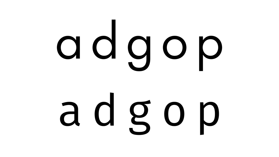
Typographers and type designers know that it’s not only the black bits that are important in a typeface: The white space around the letter shapes or in the holes (called “counters”) are just as crucial.
As you can see, the geometric character of Futura’s design leads to parts of its letters sharing the same shape as others. In typefaces like Fira, this was consciously avoided, and care was taken to give individual letterforms unique characteristics. Futura is a really nice typeface. It has a lot of personality and can fill many roles. UI should not be one of them, however. In the cases where legibility is important, the more distinct glyphs of typefaces like Fira and FF Unit are very helpful tools in a toolbox. So why forgo a helpful tool when it is available to you? “The right tool for the right job” as they say…
Context is king
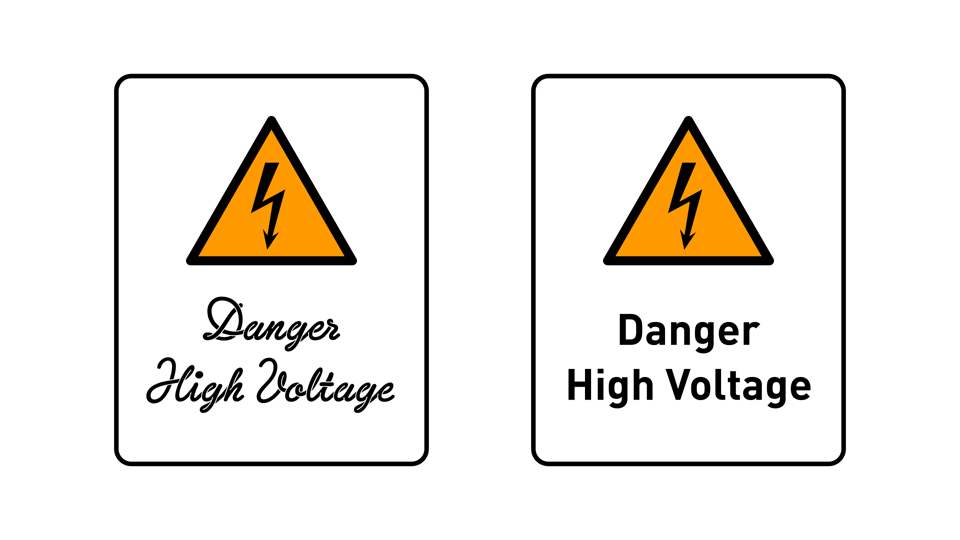
When I give my seminar about typography I ask the audience “which one is the best typeface?” The correct answer is: “It depends on the context.” To reinforce the argument, I show them this picture of the two warning signs that you see below. When the context is a sign – a warning sign even – there is a clear answer to the question: You go with the more legible one, in this case DIN on the right.
Context matters when choosing a typeface. Click the arrows for another example.
It’s not so easy to tell, however, with the word “Spaghetti” in the second picture. Here, no context is given and therefore it’s much harder to say which typeface is better than the other. You may say of course, that the example on the left, set in “Sneaker Script,” is better because it looks like Spaghetti. On the other hand, DIN, on the right, is easier to read. Sneaker Script certainly evokes the image of Spaghetti but again, without context, it’s not clear that this is in any way better than choosing the more legible typeface. In the context of brand design for a restaurant, for example, they both might work. They just evoke different feelings about the place: Where the Sneaker Script Restaurant is maybe a family place or something with a 1980s theme, the DIN counterpart might be a more upscale place. Less fun, better food. You get the idea.
So you see that there’s a good reason why many typefaces are not as legible as others. It’s simply not what they were meant to be – and that’s a good thing. We should have many more typefaces that are playful at the cost of being harder to read. But not in user interfaces. There, we certainly don’t need typefaces that are harder to read than they have to be and that have no personality on top.
- You will also have noticed just now that the typeface I use for this blog, FF Bau, doesn’t have the most distinctive letter shapes either. However, choosing that typeface was based on completely different considerations than those that would have guided the choice of a typeface for a user interface. ↑
- In FF Unit, these more legible glyphs aren’t alternatives at all by the way, but the default. Alternative characters exist there as well, but are of the flavour that are the default in SF Pro. That says a lot about which of the two typefaces was created with a “legibility-first” mindset. ↑
Thanks to Erik Spiekermann for reading a draft of this and for pointing me to a quote by Paul Renner which I didn’t know: “Der Gebrauchszweck, dem die Schrift ihr Dasein verdankt, ist nicht geschrieben, sondern gelesen zu werden.” This roughly translates to “The purpose to which the written word owes its existence is not to be written, but to be read.” Of course, Spiekermann himself once said “Wenn man es nicht lesen kann, ist es scheisse” which means “If it can’t be read, it’s shit.” I agree with both of them.
There is a discussion about this article on Hacker News. Also, if you would like to share it on social media you can do so on Twitter/X or Instagram.