In Praise of Buttons – Part Two
The Cost of Removing Physical Controls
By Nikos Kitsakis, February 2024
In part one on the topic of buttons, I wrote about buttons on screens and how bad design trends in human interface design have lead to bad usability. Now let’s have a look at physical buttons in product (or industrial) design and what has happened to those in recent years. If you are strictly a UI/UX designer in the context of design for screens, you should still read this article. In my view, the importance of the experiences of the physical world should not be underestimated when designing for screens. We use the same brain to make sense of both worlds after all.
The culprit
When the iPhone was introduced by Apple in 2007, it changed more things than many people realise. One of these was, that it started a trend for makers of all sorts of devices to try and replace physical buttons with either touchscreens or touch sensitive elements.
This trend, which is ongoing, lead to thousands of products being made which are everything from simply unpleasant to use to outright infuriating. The motivation is understandable: The iPhone was revolutionary in it’s ease of use and in that it only had one large capacitive touchscreen as a means of interacting with it. So of course other companies wanted to transplant the euphoria for that device to their own products. The problem is, however, that you cannot copy what you don’t understand. So instead of copying the philosophy of creating a good user experience (and then coming up with their own solutions), many companies only adopted the vague and misguided notion of “touch = good”.
The tumble dryer
Take a look at the video below. It’s part of the interface of the new tumble dryer in my apartment building, a typical example of this type of appliance. There are many things wrong with it and I think that we should take a moment to look at some of them.
Not only does the touch surface behave rather sluggish, it’s also confusing since you have to touch the start button longer than the others. And what purpose does that printed halftone pattern underneath the buttons serve? None it seems…
First of all, be aware that the machine actually behaved rather well during filming. It’s not uncommon to have to press multiple times on the same button to get any sort of reaction at all. More on that later.
That being said, you can see that the interface is pretty slow. For the first two “buttons” being touched, it takes almost half a second from when the finger touches the surface until you hear a beep. Imagine having this lag when you pressed a key on a piano. Feedback is important and should be immediate. If the interface of your smartphone reacted as slow as this tumble dryer, you’d throw it out the window in a second. And it’s not like a responsive interface is only a “nice-to-have” feature: A device that behaves sluggish appears to be either of low quality or somehow not working right. Neither of which is the impression you want to leave your customers with – or is it? Not to mention that the beep itself sounds rather aggressive and primitive.
The last button being touched in the video starts the drying process. As you can see, you have to touch it for quite some time before anything happens. This was apparently done to reduce the chance of the user accidentally starting it. There’s no way of knowing that, however, except for looking it up in the manual. In the real world, the user has no reason to assume that the button behaves differently from the others next to it. And the long press solves a problem that didn’t exist before the touch surface was built into the product. A physical latching button (one that stays depressed after you press it once) would have made much more sense: How it works is self-explanatory and you don’t start any process by just slightly touching it.
Mind you, also, that this sluggish and unreliable touch panel is only one part of the machine’s interface: What you couldn’t see in the video is a rotating dial, left of the touch element, to turn the machine on and choose a drying programme. The touch element is for selecting options and starting the process only. Here’s the whole interface:
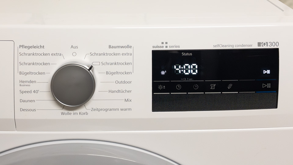
All of the controls the machine has to offer. Too many for what it actually does.
The rotating dial to turn on the machine and choose a programme with, and a latching button for start/stop would have been enough¹. There are, after all, already 15 programmes to choose from! That’s more than enough choice for the mundane task of drying clothes, so why would anyone want the options from the touch panel on top of that?
As it is, the whole thing is just needlessly confusing. If you look in the manual – and you have to if you want to make sense of what’s going on – you’ll find that there’s no fewer than 14 icons that can light up on the touch surface. That includes everything from options you have selected, to warnings about potential malfunctions. The names that are supposed to describe the different programmes on the dial are not much better.
The maker, meanwhile, seems quite happy with the product and even has a marketing text online, touting this unintuitive, slow and hard to use touch element as a highlight. This is what they write:
Supreme precision with intuition: The full-touch display allows for the intuitive control of every function of the dryer – entirely without buttons. Various LED and sound signals provide both visual and auditory feedback, ensuring unimpeded control.
Note how this description is the exact opposite of mine. Also, some of what they say is (in my opinion) not even truthful. You could of course call a device that lights up some LEDs and that reacts to touch a “touch display”, but that’s not at all what people think of when they hear that term. A touch display is a bitmapped screen – a screen that can display anything – that also has touch controls. What the maker built into the tumble dryer instead, is a touch sensitive panel with fixed icons that can either light up or not. That’s the reason I was careful to call it a “touch element” and similar terms in this text and not a touchscreen². That the user can “control every function of the dryer” is also not true. They are forgetting, apparently, that choosing a programme can only be done with the rotating dial.
The crucial – and telling – point, however, is that they are seemingly very proud of the “entirely without buttons” part. Why on earth do they consider that a good thing? The whole idea of good usability is making something usable. It has nothing to do whatsoever with either adding buttons to, or removing them from your product.
What really happened here, I think, is that the marketing department got blinded by the idea of “touch = good” and forced the product people to build something along those lines. Probably saying things like “good enough” and “we don’t have the budget” a lot during the process. What they ended up with is much worse than what could have been achieved with a clearly labeled mechanical dial and a latching start/stop button.
You cannot copy what you don’t understand
The whole point about bitmapped touchscreens was very well summed up by Steve Jobs when he introduced the iPhone in 2007. To better make his point about why the touch screen would be a good thing for the iPhone, he first showed what typical smartphones of that era looked like. “The usual suspects” as he called them. Here’s one of those:
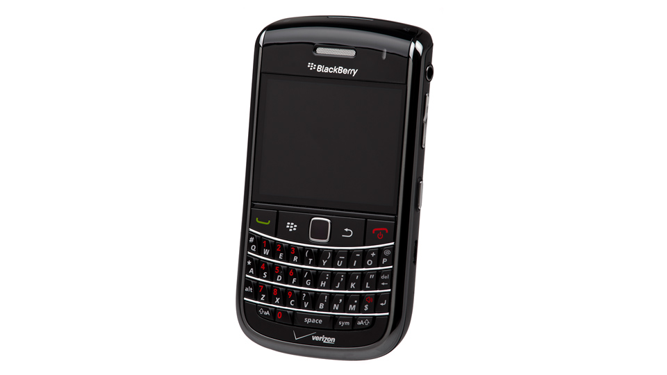
Of all the smartphones from that era, the Blackberry was particularly famous for its physical keyboard. The picture is from Wikipedia.
To contrast what they were doing with the iPhone – which at that point in the presentation he hadn’t yet revealed – Jobs said the following about smartphones like the Blackberry:
They all have these keyboards that are there, whether you need them or not, to be there. And they all have these control buttons that are fixed in plastic and are the same for every application. Well, every application wants a slightly different user interface, a slightly optimized set of buttons, just for it.
And what happens if you think of a great idea six months from now? You can't run around and add a button to these things, they’re already shipped! So what do you do? It doesn’t work because the buttons and the controls can’t change. They can’t change for each application and they can’t change down the road, if you think of another great idea you want to add to this product.
Well, how do you solve this?
It turns out, we have solved it. We solved it in computers 20 years ago. We solved it with a bitmap screen that can display anything we want, put any user interface up, and a pointing device.
The sort of people who don’t know how to copy ideas correctly don’t understand the main difference between something like the touch surface of the tumble dryer I’ve described and the touchscreen of the iPhone: The bitmapped display. The whole point of the iPhone – the main advantage over the traditional smartphones – is, that it adapts the user interface to the task at hand. In one moment you see a keyboard to write mail with, in the next, you are being presented with the big buttons of a pocket calculator³.
Contrast this with the touch surface of the tumble dryer: It offers no advantages whatsoever but actually combines the disadvantages of both worlds: A physical appearance that is fixed (since there is no bitmapped screen but just a lamp that lights up under each button) and a touch surface which, by definition, isn’t tactile (and therefore ambiguous and unsatisfying to use). Again, you cannot copy what you don’t understand.
It gets worse
What you couldn’t see in the video of the dryer above was the fact that all capacitive touch surfaces have a problem with moisture and water. You probably know this from your smartphone, if you ever tried using it in a light rain or after washing your hands: The input gets unreliable. The same thing happens with the touch surfaces on household appliances. While it might not happen too often that your smartphone display gets wet, the same thing is practically a given every time you use machines like the tumble dryer or – even worse – ceramic cooktops that have touch controls.
When the touch controls of a dryer don’t react properly, it is irritating or even frustrating. It can become outright dangerous, however, when the same thing happens with a cooktop, where you could burn yourself or even set something on fire. A friend of mine owns one of these ghastly abominations and, according to him, it sometimes even reacts to part of his shirt when he reaches across it to get to a pot. At the same time, it will often not react at all when he tries to use his fingers. Not an ideal situation, to put it mildly. Below is a video of one of these devices in action:
Cooktops with touch controls are effectively unusable. Note how ambiguous almost every touch is and how, later, the controls for the burner on the far right suddenly locked at “3” for no discernible reason.
As you can see, the controls are sluggish and unreliable⁴. It’s near impossible to make the distinction between a long press being actually expected by the device, and when a button is simply not reacting properly and has to be pressed longer (or multiple times) because of that. Not only that, but the markings for the individual stove burners are almost invisible on this particular device. The people who let me film this said, that they don’t even know all the functions and that it’s a rather unpleasant device to use. In fact, every single person I talked to who owns one of these things (or lives in a rented apartment where it came with the kitchen) dislikes using it. And I’ve talked to many people indeed.
Take note, also, of the physical layout of the whole thing: The buttons are pretty close to the burners and if there had been pots or pans on the stove, it would be much to easy to burn yourself if you tried to change a setting in a hurry. Something which cannot happen with knobs that are installed in front of the device.
Cooking is also not a sterile business. Water – sometimes boiling – will spill, sauces too, and you might have a mishap by dropping something or with a leaky bottle of olive oil. Your fingers are going to be wet, or at least damp, from washing and there might be flour or other things still sticking to them. Timing is important when you’re cooking, so there’s often no time to clean your hands like a surgeon between tasks. For touch controls to work best, however, both your hands and the controls would need to be clean.
Why do I mention all of this? Because the people who came up with the brilliant idea of touch surfaces on cooktops have apparently never cooked a meal in their life. I don’t know how else to explain what I perceive as a total failure in usability design.
And these cooktops are not only borderline impossible to use, they can also break easily. Spilling boiling water on a touch sensitive surface, for example, should be avoided at all costs, the makers say. Sliding a hot pan over them as well. Ridiculous, considering the context.
This tips & tricks article on the topic of problems with touch surface cooktops is quite telling:
Touch panels can often be problematic. This doesn’t necessarily mean they are faulty; it’s quite common for some series of devices to require two (or more) attempts before the touch panel responds and carries out the desired actions. Within professional circles, this is sometimes referred to as “acceptable production variance.”
It’s frequently suggested that if a touch panel doesn't respond correctly, or only does so every second or third press, instead of using a finger, one should use a bottle cork for operation. Some users of glass-ceramic cooktops swear by this method.
I hope this sounds as much as a bad joke to you as it does to me. Imagine replacing a perfectly fine stove – one with knobs – with a touch surface one, only to then have to deal with this sort of thing.
I also wonder who these “professional circles” are supposed to be. It can’t be professional chefs, since they use stoves that have knobs – and for good reasons too. If you think about it for a second, you’ll realise that professional chefs also don’t have any extra functions on their stoves of the kind that you find on the touch panel ones: No timers, no simmer mode, no automation, nothing. Just knobs to change the heat with⁵. Funny, then, how a professional will be able to cook many more – and better tasting – items than most people, in a shorter amount of time and on a stove that is much simpler.
Again, I suspect that all of this comes down to the “touch = good” fallacy. And I can’t help but think that the marketing and product development departments in the companies that make these products function in a similar way to what P. G. Wodehouse described here, when he was talking about Hollywood:
It is not easy to explain to the lay mind the extremely intricate ramifications of the personnel of a Hollywood motion-picture organization. Putting it as briefly as possible, a Nodder is something like a Yes-Man, only lower in the social scale. A Yes-Man’s duty is to attend conferences and say “Yes.” A Nodder’s, as the name implies, is to nod. The chief executive throws out some statement of opinion, and looks about him expectantly. This is the cue for the senior Yes-Man to say yes. He is followed, in order of precedence, by the second Yes-Man – or Vice-Yesser, as he is sometimes called – and the junior Yes-Man. Only when all the Yes-Men have yessed, do the Nodders begin to function. They nod.
Lacking any evidence, I think this is as good a description as any of what must have happened when those touch control stoves (and all those other “touch = good” devices) were first thought up. Someone high up wanted something that didn’t make any sense and nobody said “no”.
Knobs and buttons work. They might seem uncool at first but they work. That’s the most important part. I can’t speak for my readers but personally, I’m a much bigger fan of “working product = happy customer” than I am of “touch = good”. And if you have a good industrial designer, knobs and buttons can look really good too. If you don’t believe me, look at what Teenage Engineering does with their audio devices:
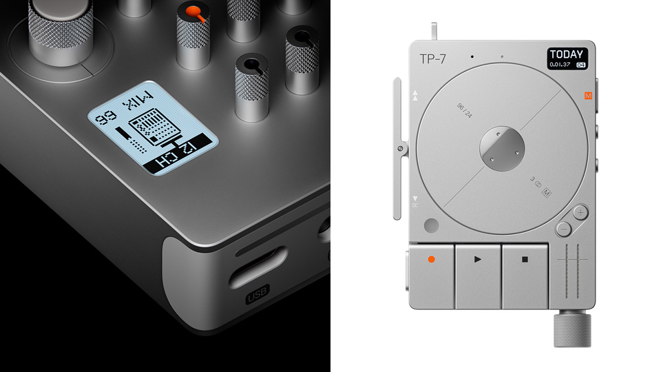
Knobs and buttons can be quite attractive indeed. The pictures are from the website of Teenage Engineering.
Buttons to the rescue?
Are knobs and buttons – and sliders, switches, dials and levers – the ultimate solution to the problems of user experience in physical devices? Of course not. Like always in the design business, you have to know when to use what kind of solution.
Karl Popper’s epistemology, particularly his theory of falsification, might help though. It says that while we cannot conclusively verify the absolute truth of scientific hypotheses, we can determine if they are false. In the same way, I can’t say if a button or a knob is always the best idea. Again, it depends on the product and the context. A touch panel without a bitmapped display which is slow to react or sometimes won’t react at all, however, is certainly never a good idea.
- Just to remind ourselves what we are talking about: This is a machine that is basically a rotating drum that uses hot air and has a means of getting rid of excess water. It’s not exactly rocket science. The machine just varies the rotation speed, heat and duration based on one of the drying programmes that the user selects. Physically, that’s all that happens. ↑
- I would really like to know what a “full-touch display” – as the maker calls it – is supposed to be. “Touch” didn’t sound like enough for the marketing people so it had to be “full-touch”? ↑
- Having said that, the software keyboards on iPhone-type smartphones actually aren’t as comfortable to use as physical ones. However, they are the correct trade-off. You gain much more than you lose. Also, the main advantage of the iPhone over the traditional smartphones was actually the touchscreen in combination with OS X as a foundation, and a very well executed user interface. However, bringing all of that up would have gone beyond the intended scope. ↑
- If you looked closely, you will have noticed the red lights from the cooktop spilling into my finger at certain points. This was unavoidable during filming and is not a sign of the video having been altered in any way. The surroundings were rather dark and I suspect the iPhone camera has a bit of a problem with residual light from strong light sources. ↑
- What you saw in the video I filmed is actually one of the more restrained devices in terms of the user interface. If you do a web search, you’ll find cooktops with UIs that rival in complexity what the helmsman of the Starship Enterprise has to deal with. ↑
I could have probably mentioned Apple’s newly released VR headset, the Apple Vision Pro, in this piece, but that would have gone beyond the scope. Just one thought regarding that thing though: Having now read about how the tactile sensation of buttons and their other advantages are something to prefer whenever possible, is it really a good idea to introduce a user interface that foregoes even touching the glass surface of a touchscreen and instead, involves pointing with your fingers at virtual objects in thin air? I can see the novelty, of course, but what happens when that wears off? Would you want this sort of interface on any appliance? Computing or otherwise? I’ll let you guess my answer…