Parochialism, Language and Usability
Beyond Silicon Valley’s Echo Chamber
By Nikos Kitsakis, December 2023
If you live outside the United States, what I’m about to write will probably be very familiar to you: You use some product – mostly some software or an internet service – and it doesn’t work the way it should. Why? Because the people who made it are clueless about the specifics of the region you live in, the language you speak (or prefer to use), or some other cultural nuances. This, I assume, is mostly due to the developers being 20-somethings who sit in Silicon Valley, can only speak English and never travelled anywhere.
These circumstances lead to some interesting and – for users – sometimes extremely vexing problems in design. I call this design parochialism. Let’s look at a few examples.
Will I catch my train?
One of the things that often bugs me is the fact that the clock on the iPhone lock screen won’t show seconds and can’t be configured to do so. Why is that a problem? Well, if you live in a country that actually has working infrastructure like effective public transport (unlike the U.S.), you will have trains that leave at specific times. So when you’re hurrying to the station and are nearly at the tracks, knowing if you have one or two more minutes to catch your train can make quite a difference. A quick glance at your iPhone’s screen won’t help much, though.
Consider this situation: Your train leaves at 11:45. You know that with only one more minute of time left, you would have to run; with two, you can take it easy. But if your iPhone only shows you that it’s 11:43, you have no way of knowing if it’s 11:43 and three seconds or 11:43 and fifty-five seconds. That’s almost a whole minute’s difference.

The iPhone lock screen clock lacks an option for displaying seconds.
Of course people from Silicon Valley wouldn’t know that. It’s a car culture so an issue like that doesn’t come up. Now, I’m aware that there’s a lot of people from other countries working at the software companies in California, but my hypothesis is that they either don’t get heard when they bring up something like this or – more likely in my opinion – they forget about these things themselves because they are embedded in a different environment now.
Where’s my exit?
Another example is the sad story of Apple Maps. That service is so laughably bad in the context of design parochialism that I genuinely wonder how it can still exist. There’s a lot you can say about it, but my personal test has always been the metro exits in Tokyo: I frequently visit Tokyo, and it quickly becomes apparent that the names of the (sometimes hundreds of) exits are quite important. Even businesses often describe their location as being, for example, “Close to Exit C6 from Shinjuku Station” on their websites or business cards.
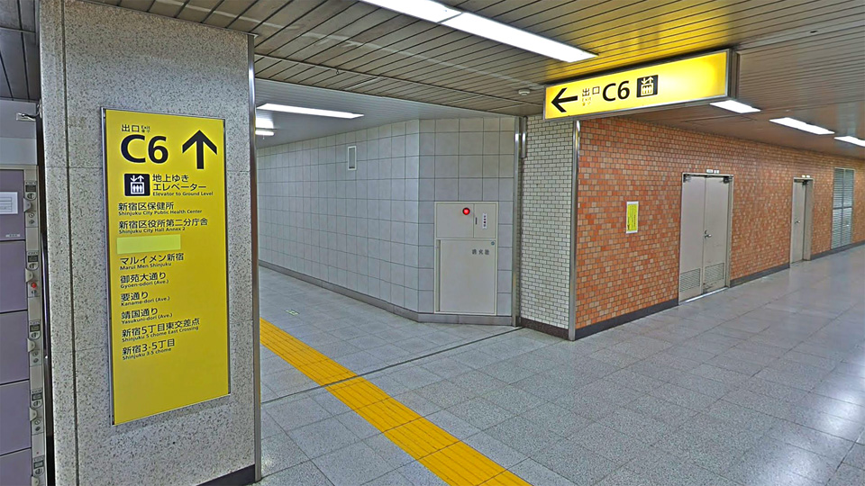
The C6 exit at Shinjuku Station, Tokyo. The picture is from Google Street View.
Exit numbers are genuinely useful for orientation since the signage is well-designed and they are marked on almost every paper map and Google Maps. On Apple Maps, however, they are missing. Compare a screenshot from Google Maps with one from Apple Maps below.
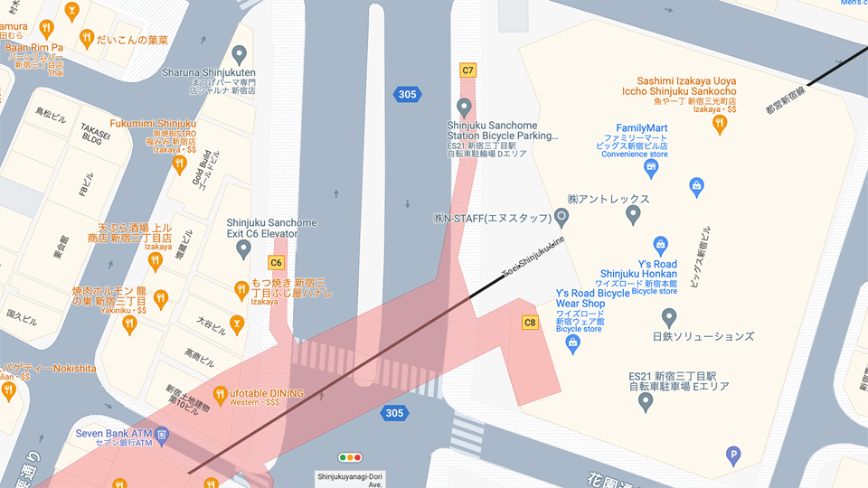
Google Maps: You can see three exits (C6, C7 and C8) in yellow on this screenshot. The nice touch here is that the yellow matches the colour of the actual signage in real life.
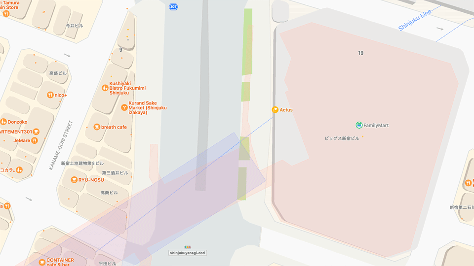
Apple Maps: This is the same region as on the screenshot from Google Maps above. Note the absence of the exits and the general absence of information when comparing it to the Google product.
It’s really rather incredible to me how something as obvious as the metro exit numbers in Tokyo could be missing from Apple Maps. But maybe that’s the whole point: It’s obvious when you are embedded in that environment, not so much when you’re not. As for the place we are talking about, Tokyo is the largest city in the world, where public transport is so crucial that the amount of train tracks laid down rivals that of the entire country of Germany! That gives you an idea of the importance of the trains and metro and everything to do with it. And it’s not as if Apple Maps is still that new thing where you could cut Apple some slack for not getting everything right in the first version. At the time of this writing, Apple Maps is eleven years old after all…
Again, I think this is most likely due to design parochialism. The makers of the product don’t use the product. And it shows.
Language and culture
The issues of design parochialism I mentioned above might seem a bit specific, but they are comparable in nature to the issue I have with the save dialogue box. That is to say it’s not that the problems are (for the most part) absolute show-stoppers by themselves, but rather that there are so many of them in almost every product. What makes these problems really frustrating is that, in my opinion, most of them would be easily solvable.
The most annoying of these issues, and the one that I believe affects most people outside the parochial little world of Silicon Valley, is the problem of preferred language.
In my experience, this impacts nearly everyone, to varying degrees, whose native language isn’t English. Again, most software and services originate from the United States, a predominantly monolingual country, where this issue seldom arises. If you don’t believe me, consider this example as an indication of the culture:
In early 2022, the Washington Post published an article titled “The remarkable brain of a carpet cleaner who speaks 24 languages” written by a certain Jessica Contrera. The article profiles a man called Vaughn, a carpet cleaner with an uncanny talent for picking up new languages. He knows over 37 but feels comfortable using about 24 fluently.
One of Vaughn’s customers described him as “A real, live polyglot…” which led Contrera to write, “I’d never heard of that word – meaning, a person who can speak several languages – before meeting Vaughn”.
On her website, Contrera states she is “… the recipient of the 2022 Anthony Shadid Award for Journalism Ethics and a three-time finalist for the Livingston Awards”. If you look up the Livingston Awards on Wikipedia it says “Popularly referred to as the ‘Pulitzer for the Young’, the awards have recognised the early talent of journalists…”.
Now, carpenters work with wood, programmers with code, and journalists, one would presume, with language. So how is it that this journalist had never heard of a word that specifically describes a language ability? I’m not a journalist or a writer, but I had heard and understood the term “polyglot” well before I was a teenager. It’s basic common knowledge – unless of course you’re raised in a monolingual culture.
Another example, one that every native German speaker knows (and laughs about), is the portrayal of Nazis in Hollywood movies. When watching one of these films in its original English, there’s often a scene where some Nazis walk past the good guys, and you overhear them speaking “German”. With budgets often exceeding 100 million dollars, you’d think the producers could manage to cast native German speakers for even just one sentence, right? Well, apparently not. The actors mostly have English accents far thicker than Arnold Schwarzenegger’s Austrian accent is in his English…¹ And while this isn’t technically a usability issue, it certainly ruins the mood. More than that, though, it speaks to the same lack of language sensibility in the English-speaking world that I pointed to in the example of the journalist above.
There are indeed countless examples of this sort of issue that I could mention. However, what really interests me is when this sort of thing creeps into product design.
I should note at this point that I write from a somewhat unique perspective: I live in Switzerland, a country with four official languages. But what I’m discussing holds true for many other nations in Europe and around the world. This becomes evident once you bring up this issue with people from those countries. Or put differently, I have yet to meet anyone who didn’t know what I was talking about when I mentioned this problem.
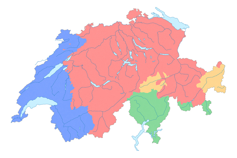
The languages of Switzerland: Red for the German-speaking majority, blue for the French-speaking population, green for Italian, and yellow for the Romansh-speaking minority. The image is from the Federal Statistical Office of Switzerland.
Language as a choice
The important thing to keep in mind is this: For people who speak more than one language, language is a choice, not a preference. My native language is German, but I opt (for example) to use all my video software in English. Why? Mainly because the professional jargon in film and video predominantly revolves around English². This means there are more tutorials and tips available online in English than in German. This approach spares me, amongst other things, the hassle of having to guess what the German equivalent might be for a specific term that I just read in English.
Users have all sorts of reasons to use different language setups. Reasons that you could probably never predict as user scenarios in a meeting of UX specialist. I myself had my iPhone set to Japanese for a long time so that I would be exposed to that language every day. At the same time, I preferred some specific applications to be in either German or English.
However, the ability to set the app language on an individual basis became possible only in 2019 with iOS 13, a full 12 years after the original iPhone was released. On the Mac, it also became (officially) possible only in 2019 with macOS Catalina, though you could do it in a not very elegant way before that. Catalina was released 35 years after the original Macintosh…
World Wide Web
Websites are a funny thing too in that regard. Consider for a moment what the first two “w” in “www” actually mean. I don’t know if there is some API or database with crude information making the rounds, but often when I visit a website from the German-speaking part of Switzerland, I’m presented with the French version of the site. This almost exclusively occurs with websites from companies based outside Europe. My hypothesis is that Geneva, known internationally for being the home of CERN and the United Nations, overshadows the rest of Switzerland in fame, leading some to assume that the language spoken there is the same throughout the entire country.
Then there’s the matter of typing “.com” at the end of a URL only to be redirected to a localised version. Bing and Google do this for instance. They both serve up German but Google at least offers the choice of English in addition to French and Italian. Bing, on the other hand, provides only French and Italian as alternatives to German, requiring a deep dive into the settings to switch to English. Remember that English is an international language. You will have people in Switzerland (and other countries) that don’t speak any of the local languages and are therefore even more dependent on having an English version readily available. Also, people usually know their top-level domains and use them deliberately. People in Switzerland, for instance, will type in .ch, .de, .uk, or .com, depending on what version of a site they want to visit. To assume that you, as a developer (or someone from marketing), know better, is presumptuous and condescending.
For the longest time, Apple handled this perfectly. If you typed in apple.com, you would actually end up at apple.com. They’ve since made a slight adjustment: You’re still taken to apple.com, but a small bar at the top now prompts you to consider visiting the local version of the site, which is an acceptable approach.
Wikipedia (at wikipedia.org) famously begins with a language selection page, featuring a search field that also includes a language option. That’s the right way to do it for a site like that.
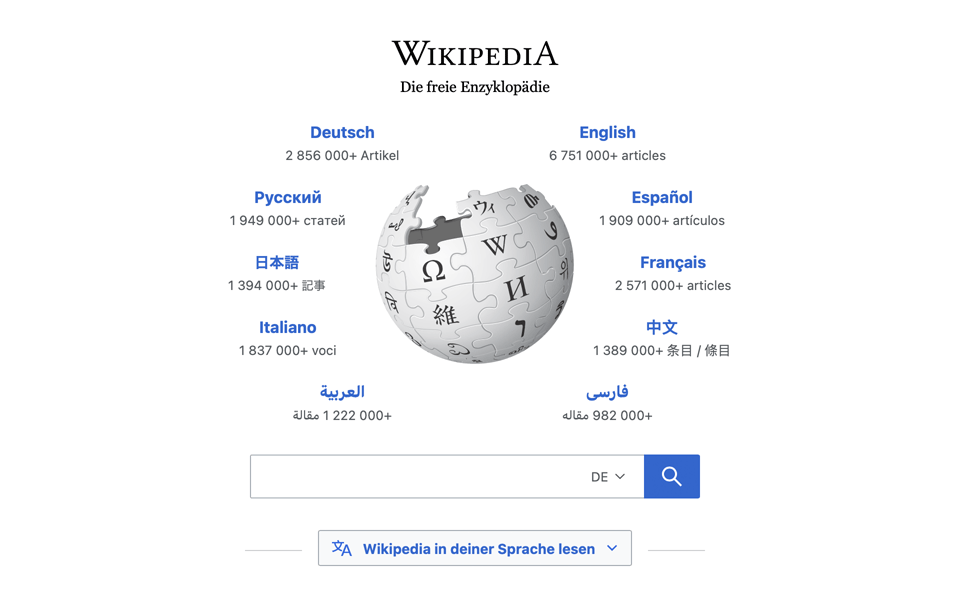
The homepage at wikipedia.org is very language-sensitive: Not only can you pick a version of the site, but you can also select your preferred language in the search box.
YouTube, however, does something really idiotic. There, the choice of language affects not just the interface, but also the actual names of the videos. Those names are (as opposed to the interface language) automatically translated – and very poorly, I might add. Take a look at the example below. The owner of this particular YouTube channel is a German native speaker who uploads old VHS recordings of German news programs from around the time the Berlin Wall came down. Her videos and their titles are, by definition, in German. However, if you set your YouTube preferences to English – as I do, because I prefer the interface to be in English – the names of her videos change as well. For instance, the rather famous news program “Tagesthemen” gets translated to English as “Topics of the Day”. Now, while not technically incorrect, such names shouldn’t be translated. For example, if I were to talk in German about “USA Today” I wouldn’t call it “Vereinigte Staaten von Amerika heute”.
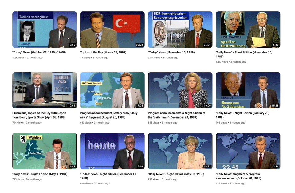
You can see some of the original German names in the thumbnails (such as “Bericht aus Bonn” and “heute”) alongside the automatically translated names in the video titles – an idiotic practice that serves no purpose.
Again, this sort of thing is idiotic, presumptuous, condescending, and, most of all, parochial. If you want to give your users an option like that, fine. But let them choose the language of your website separately from the option of translating the content.
And don’t get me started on the topic of streaming services with movies and TV shows. Netflix, Apple TV, and others often fail to even offer the option of watching a movie in its original language, not to mention letting you choose the subtitles you prefer – a feature that should be laughably easy to implement.
Solutions
If you work on products or services that will be available in a region you don’t know anything about, do your research. Ask locals for advice, but remember that they might have language preferences that don’t seem logical to you. Take, for instance, myself: A native German speaker in Switzerland who mostly prefers his software and books in English but has his mobile phone set to Japanese… Would you have predicted that use-case?
So much for language issues. As for the examples of the maps and the iPhone clock I mentioned earlier, these are just two of many instances where design parochialism is admittedly not so simple to address. The ideal solution is likely to have teams that not only work within but also originate from the specific countries where the products or services will be available.
If you’re from outside the U.S. but find yourself working there on products affected by these issues, make sure to voice your concerns. You, more than anyone, should understand how frustrating these issues can be for your users. Making your voice heard can lead to products that are easier to use and spare your company from appearing ignorant and parochial outside the English-speaking world.
And remember: Something like the case of the missing exit names in Apple Maps for Tokyo doesn’t just make the product harder to use, but effectively unusable in that context. There are many such cases and they can break functionality completely for some people.
- It gets funnier still when you see the making-ofs of some of these movies. The producers and directors will talk endlessly about their attention to detail throughout every step of the production. Yet, the Germans in their movies talk like used-car salesmen from Brooklyn. ↑
- I’m using InDesign in German for the same reason. ↑
Many of the things I mentioned in this piece can be applied to almost any combination of the country of origin of a product and where it’s going to be used. The focus on Silicon Valley, or by extension the U.S., has only to do with the fact that most everyday products are now powered by software and therefore originate from that particular culture. The issue of design parochialism, however, is not just one of software or recent products.